


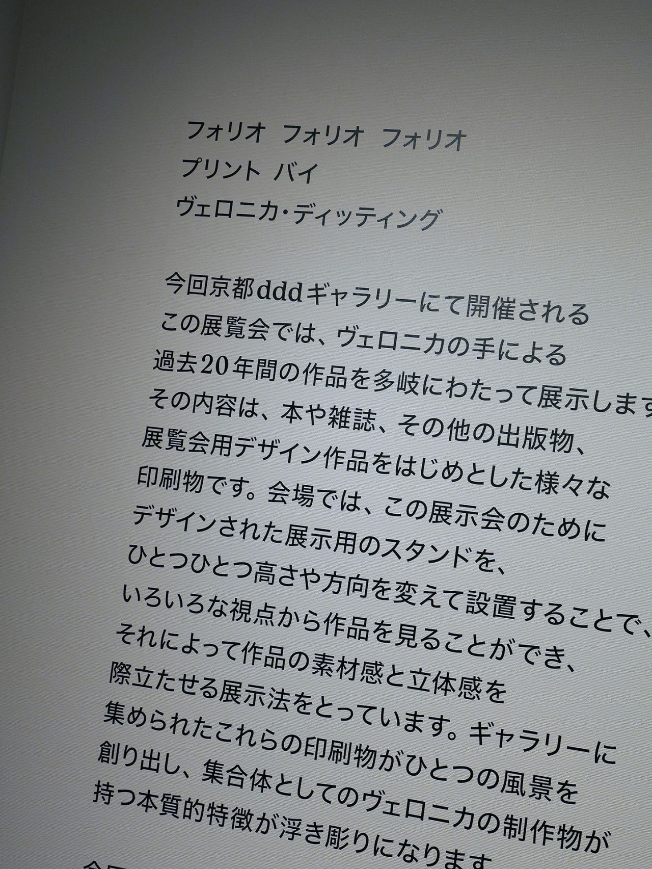
長い時間をかけて感性を磨き、自分のものにする。ヴェロニカ・ディッティングのデザイン

veronica ditting
photography: chikashi suzuki
interview & text: manaha hosoda
translation: jun iwasaki
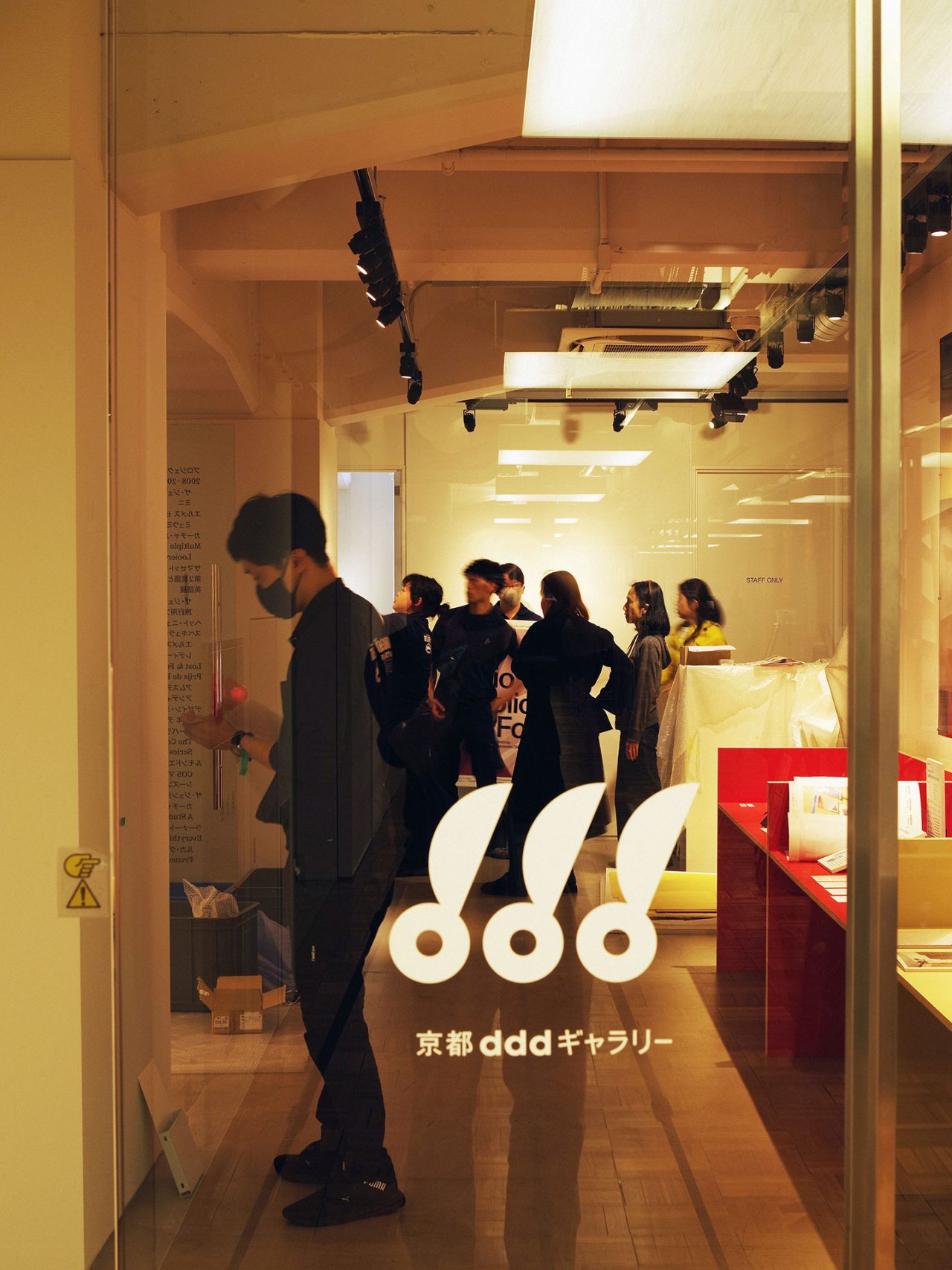
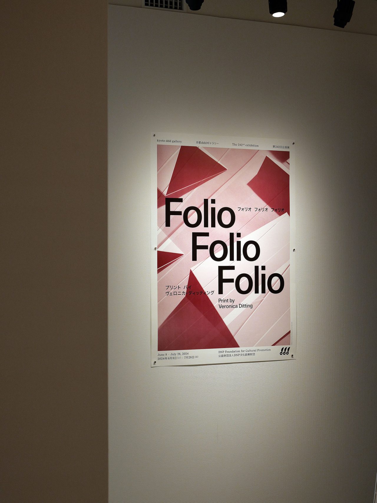
シンプルでありながら、研ぎ澄まされた感性と知性を感じさせるデザインは、どのようなこだわりと哲学から生まれるのか。『The Gentlewoman(ザ・ジェントルウーマン)』のアートディレクターを長年務め、創立メンバーとしてその礎を築いた一人であるVeronica Ditting(ヴェロニカ・ディッティング)が、自身初となる個展を京都 ddd ギャラリーにて開催中だ。Hermès(エルメス)やLouis Vuitton(ルイ・ヴィトン)といった名だたるファッションブランドをクライアントに持ち、印刷物からデジタルまで様々なメディアを横断。ヨーロッパにおけるデザイン業界を第一線で牽引する彼女が、本展では20年におよぶキャリアを振り返っている。
彼女の印刷物への並ならぬ思い入れはもちろん、膨大な情報量にも関わらず、考え尽くされたディスプレイが、これ見よがしではなく彼女の知見の深さを物語る。クリエイティブに携わるものであれば、一度は足を運びたい本展を前に、今回メールインタビューを敢行。さらに、共通の知人を多く持つ写真家の鈴木親が、実際に京都へと足を運び、設営に臨む彼女の姿を捉えた。
長い時間をかけて感性を磨き、自分のものにする。ヴェロニカ・ディッティングのデザイン
Design
*English text follows the Japanese
—今回、あなたの初めてのソロエキシビションが京都で開催されることになりましたが、キュレーションを手がけた Emily King (エミリー・キング) とどのようなきっかけでプロジェクトがスタートしたのでしょうか。またそのプロセスについても教えてください。
Emily King と出会ったのは、まだ私がアムステルダムに住んでいた12年ほど前のことで、その頃彼女は定期的に『Fantastic Man』と『The Gentlewoman』に寄稿していました。彼女のグラフィックデザインを中心としたデザイン史家の仕事は、私にとって非常に際立ったものでした。そして、時が経ち2020年、ロンドンのデザイン・ミュージアムで開催された「Design of the Year (デザイン・オブ・ザ・イヤー)」の展覧会で一緒に仕事をしました。昨年の秋に、京都 ddd ギャラリーから Emily 宛に展覧会企画の話があり、彼女が私に声をかけてくれました。あまり深くは考えませんでしたが、すぐに決断しました。私にとってのデザインヒーローたちは京都 ddd ギャラリーやギンザ・グラフィック・ギャラリー(ggg)で展覧会を開催していましたし、プロジェクトで日本に来ることは長く私のウィッシュリストにありましたから。
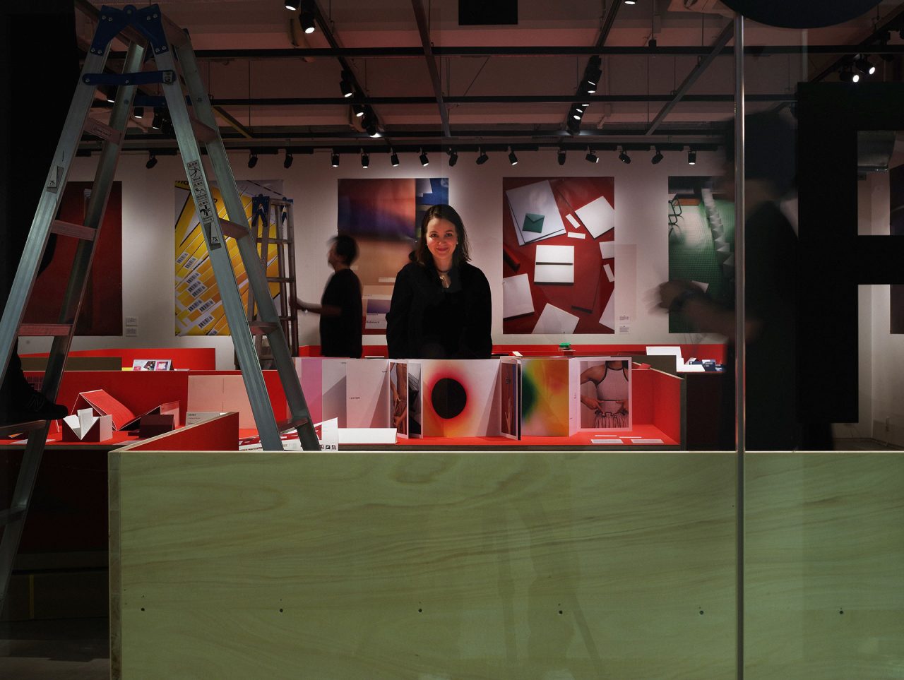
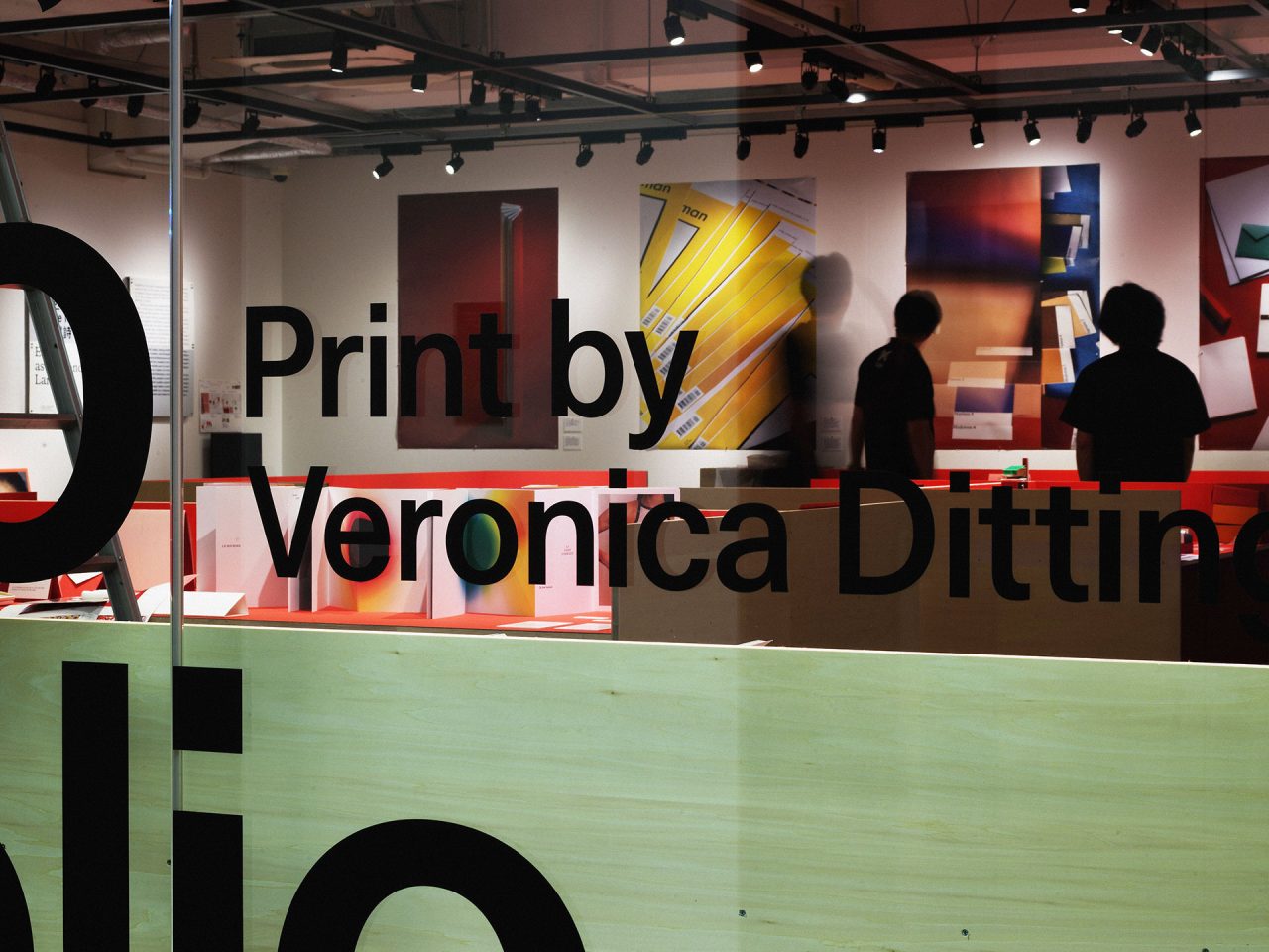
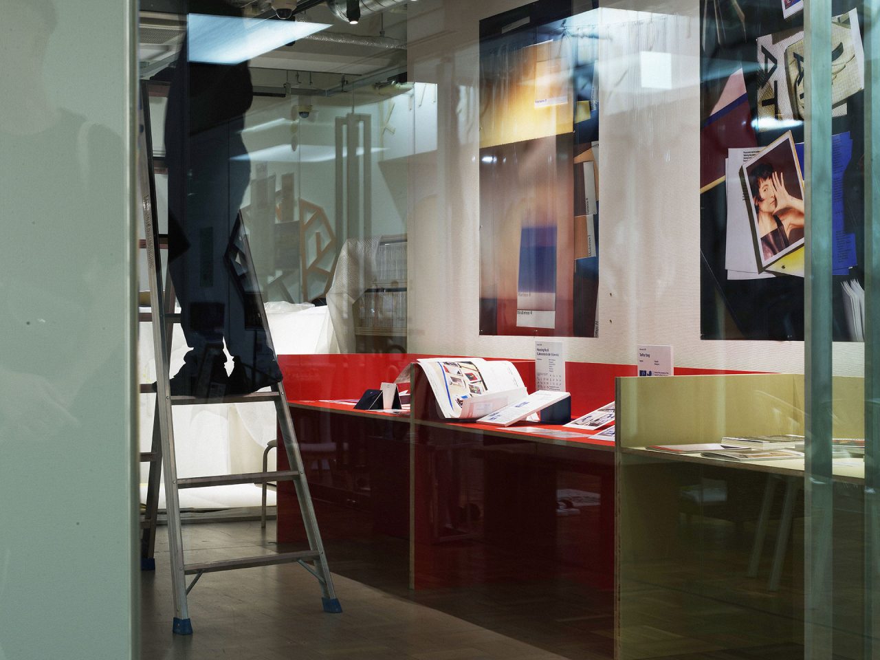
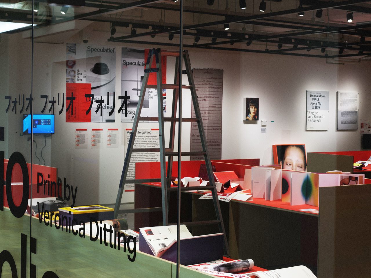
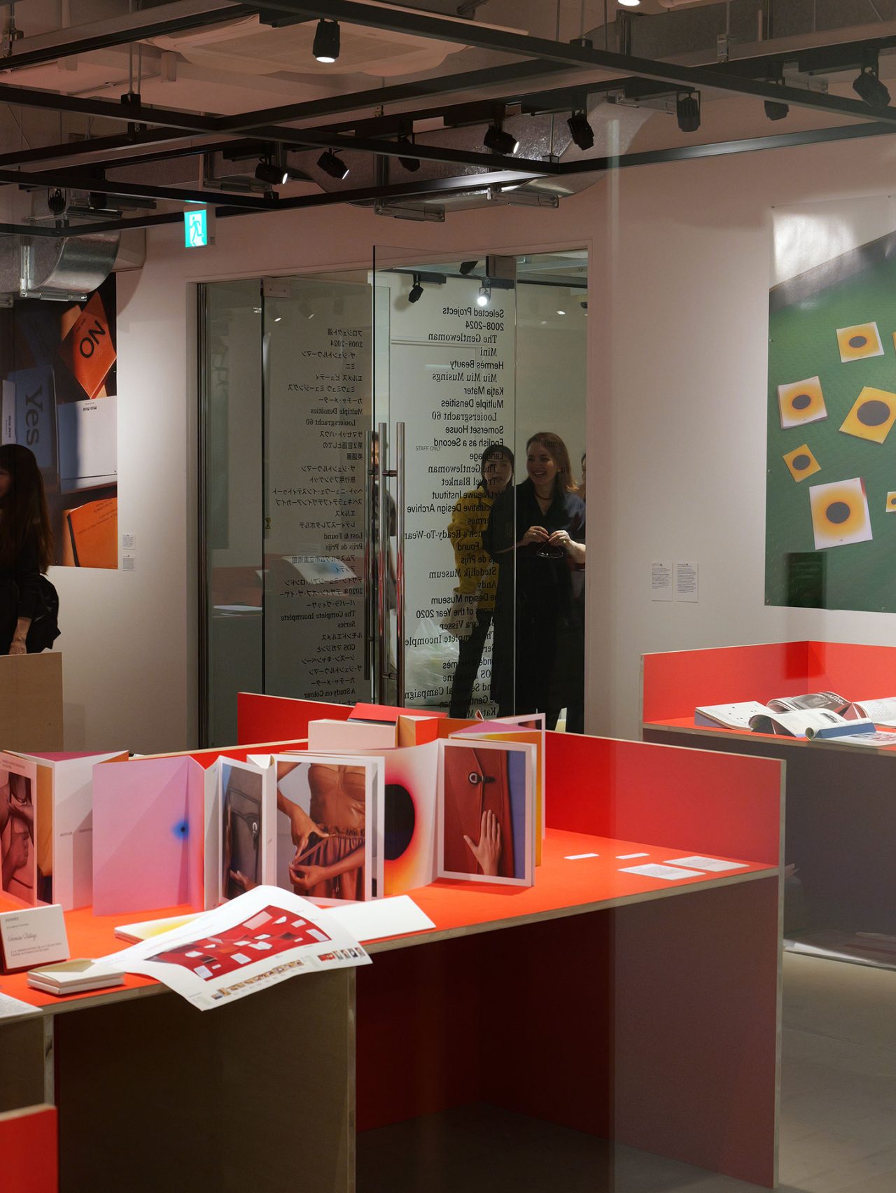
現在、Emily と私はロンドンに拠点を置いています。しばらくの間、バービカン・センター(ロンドンにある居住部を併設したヨーロッパ最大の文化施設)にある私のオフィスで毎週か隔週かでミーティングを行い、私のプリントアーカイヴに目を通し、作品の選考や展覧会の全体的なアプローチについて話し合いました。私は、自分の物質としてのアーカイヴをアップデートするのが得意ですが、今回の展覧会ではそれが試されるような良い機会となりました。私の作品を展示するには、とても様々な形や方向性を取ることができます。多くの作品はイメージ作りを基本としていますが、京都 ddd ギャラリーがグラフィックデザインのギャラリーということもあり、今回の展覧会はその角度から構成しました。グラフィックデザインの展示は、私の作品の性質上難しいのですが、今回の展示ではとても頑丈なボードを使ったスタンドを使うアイデアがすぐに浮かびました。私のオフィスで合計155個のスタンドを丹念に仕上げました。
—過去20年間における様々な作品を展示していますが、その年月を一挙に振り返り、何か立ちのぼってきたものはありますか?また、『The Gentlewoman』は間違いなくあなたのキャリアにおける大きな転換期になったかと思いますが、痛烈に記憶に残っている作品があれば教えてください。
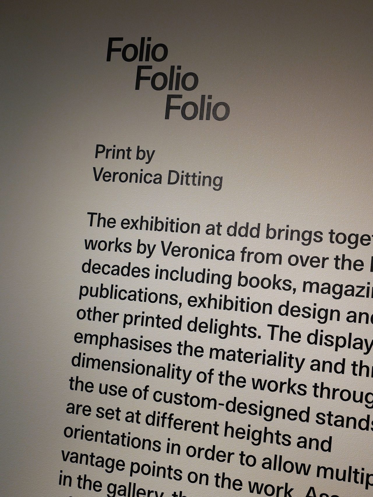
正直にいうと、いつも先に進むことや次の仕事について考えていて、過去の仕事を振り返るということはしたことがありませんでした。今回の展覧会「Folio Folio Folio」は、立ち止まって Emily と共に自分の仕事を振り返る、いい機会となりました。今回の展覧会では、私の成長や仲間たちとのコラボレーション、シリーズものなど、意味のある仕事だけを展示することにしました。私が『The Gentlewoman』に関わっていたのは12年余りですが、はっきりとしたターニングポイントというものは長い時間をかけて形成されました。

Photography by Hanna Moon ©︎Veronica Ditting
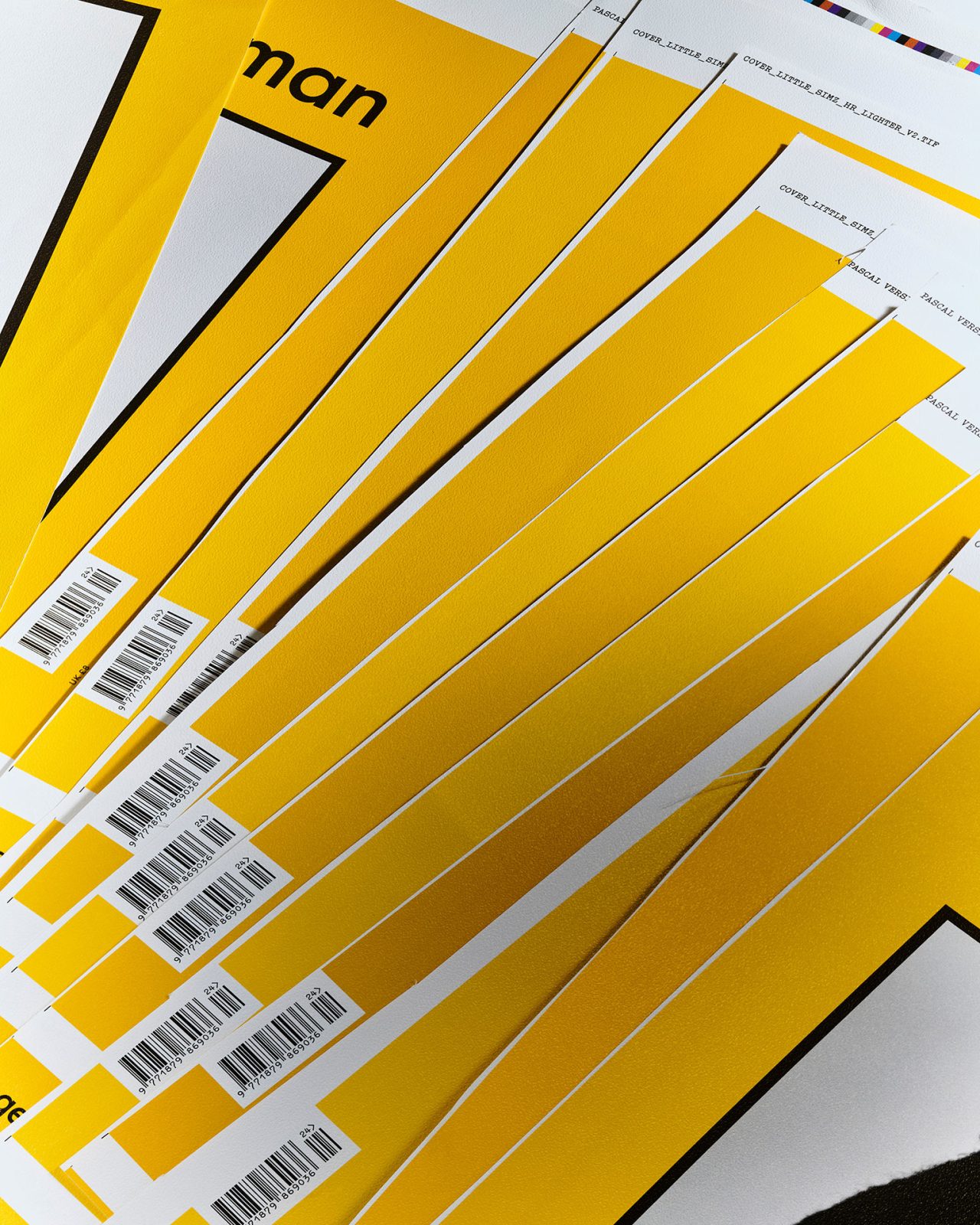
2008年にアムステルダム市立美術館のために制作した雑誌『Andy』もその一つです。これは、私のキャリアの初期の仕事で、若い頃にとても素晴らしい機会をいただきました。チームは、私と編集者の Arjan Reinders (アルヤン・ラインダース) の2人のみで、制作期間も執筆や画像など含め最初から最後まで2週間しかありませんでした。使用した画像のほとんどは、Andy Warhol (アンディ・ウォーホル) が広告キャンペーンや社説などの有名なメディアに登場した時のものです。Oliviero Toscani (オリビエロ・トスカーニ) と Ron Galella (ロン・ガレラ) の二人から画像使用を許可されたのは幸運でした。この出版の仕事は、『The Gentlewoman』の参考文献のセクションや情報をレイアウトするのに大きな影響を与えました。納期はとても大変で、印刷の締め切りに間に合わせるために最後の二晩は徹夜をしたのを覚えています。

Photography by Qiu Yang ©︎Veronica Ditting
—本展では写真作品も展示され、これまでに作ってきた印刷物の物質としてのユニークさを感じられる展示となっています。雑誌だけでなく、インビテーションなどを手がけるあなたの並ならぬ紙へのこだわりがうかがえます。印刷物を手がける時にあなたが大切にしていることを教えてください。
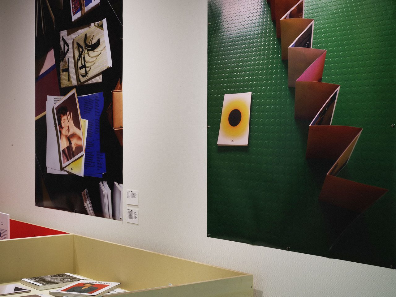
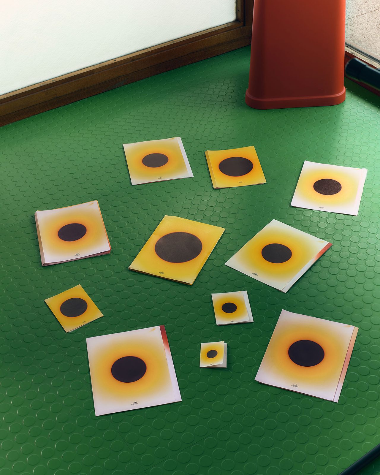
私が制作プロセスの多くの段階で深く考えることは、印刷された物体を手に取ったときにどのように感じるかというシンプルな感覚です。これは、触感や物質性という価値観につながるものなのです。私は割と勉強熱心で、プリントされたオブジェクトの形式的な探求を楽しんでいます、どんなプロジェクトもスケールと比率から始めます。素材の調達から配色、プリント工程の正確さまで、デザインプロセスのすべての段階を考慮していますが、この作業が私の作品を特殊なものにしていると信じています。また、印刷業者や製本業者と近くで仕事をするという側面は、印刷物における工芸品の要素を物語っています。写真家 Qiu Yang (チュウ・ヤン) と私は同じ時期に Gerrit Rietveld Academy (ヘリット・リートフェルト・アカデミー) で学びましたが、彼が私の作品を撮影する方法がいつも好きでした。今回の展覧会には12枚のポスターがあり、それぞれがアプローチとプロセスの異なる側面を示しています。私独自のパントンカラーの調合からスケールや比率の探求までを含むこれらのイメージは、印刷物の本質を明らかにし、祝福するものです。
Photography by Qiu Yang
©︎Veronica Ditting
Photography by Qiu Yang
©︎Veronica Ditting
—その一方で、デジタルでの表現やデザインについても無視することのできない時代になりました。あなたのSNSを拝見するとポジティブにデジタルを活用している印象を受けましたが、デジタルやSNSとはどのように付き合っていますか?
デジタルでの表現は、近年の私たちのプロジェクトの中で大部分を占めています。例えば、ファッションブランドのキャンペーンを手がけた場合、動画はブランドのウェブサイトとソーシャルメディアにしか存在しません。それに、私自身のソーシャルメディアでは完璧なものを目指していませんし、完璧を目指したとしてもできないのです。いつも1シーズンくらい投稿が遅れているような気がしますし、自分のフィードを見てもプロジェクトのギャップがとても多いです。
—デザインにおけるフィジカルとウェブでの違いについて、教えてください。決定的な違いはあるのでしょうか?
印刷された場合は、結果ははっきりしていて、一つのサイズ、一つの比率しかありません。ある時点で、印刷所にファイルを渡すとその一つしかありません。それから、印刷や製本されたものは後戻りできません。しかし、ウェブデザインの場合は明確な終わりというものがなく、形も自由です。それゆえに明確な定義すらありません。どちらに対しても違う考え方が必要です。
—これまで多くの素晴らしいクリエイターたちと仕事をしてきたかと思いますが、特に印象に残っている仕事はありますか?その仕事によって、クリエイティブへの考え方に受けた影響なども教えてください。
過去20年間の仕事を振り返ると、経験やコラボレーション、学びといった理由からいくつかの記憶に残るプロジェクトがあります。例えば、2008年の Barbara Visser (バーバラ・ヴィッサー) によるモノグラフ「The Complete Incomplete Series」は、画像編集について多くのことを教えてくれたプロジェクトでした。私は、アート・アカデミーを卒業した後、1年間 Barbara のアシスタントを務めていたので、彼女のアーカイブをとてもよく知っていました。そのおかげで、まだ彼女の代表作には含まれていないような作品をたくさん取り入れることができました。彼女の写真プロジェクトをより完全な形で説明するために、参考資料やBロールの画像、出版物の複製を取り寄せました。プロジェクト期間中、私は画像の編集とシークエンスを何度も作り直しました。画像のシークエンスで得られるリズムは、見る人を独特な旅に連れて行ってくれるのです。

オランダ人アーティスト、バーバラ・ヴィッサーの写真プロジェクト『The Complete Incomplete Series』のモノグラフ Photography by Qiu Yang ©︎Veronica Ditting
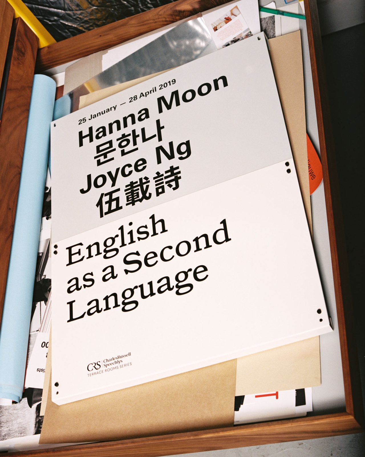
そのほかに思い浮かぶのは、2019年に Shonagh Marshall (ショナー・マーシャル) がキュレーションしたサマーセット・ハウスでの Hanna Moon (ハンナ・ムーン) と Joyce Ng (ジョイス・ン) による「English As A Second Language」の展覧会デザインです。Hanna と Joyce から展覧会のデザインをしないかと打診を受けました。これが私にとって初めての空間デザインの仕事で、工業デザインのバックグラウンドがある私にとって、このスキルを発揮する最初の機会でした。Hanna の部屋はミッドナイトブルーに塗られ、ギャラリーの壁の一部のように見える箱にプリントを額装しました。一方、Joyce の部屋はジグザグに仕切られ、彼女の作品の一部を展示しました。各作品は、技術的な情報と背景の2つのキャプションで説明されており、どちらも特注のパウダーコーティングされたキャプションパネルを使いました。「English As A Second Language」は、当時サマーセット・ハウスで開催された展覧会の中で、最も来場者が多かったもののひとつで、今でも誇りに思っているプロジェクトです。
Photography by Joyce Ng
©︎Veronica Ditting
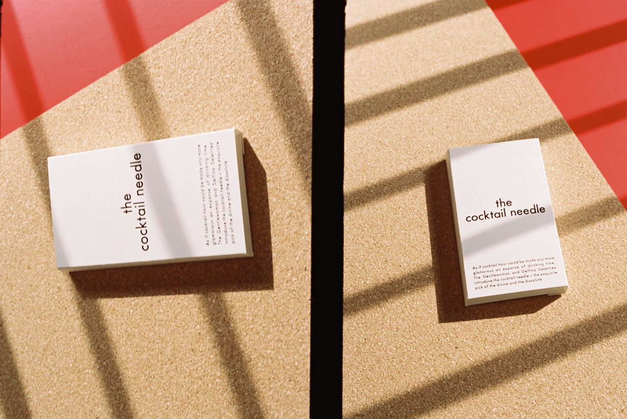
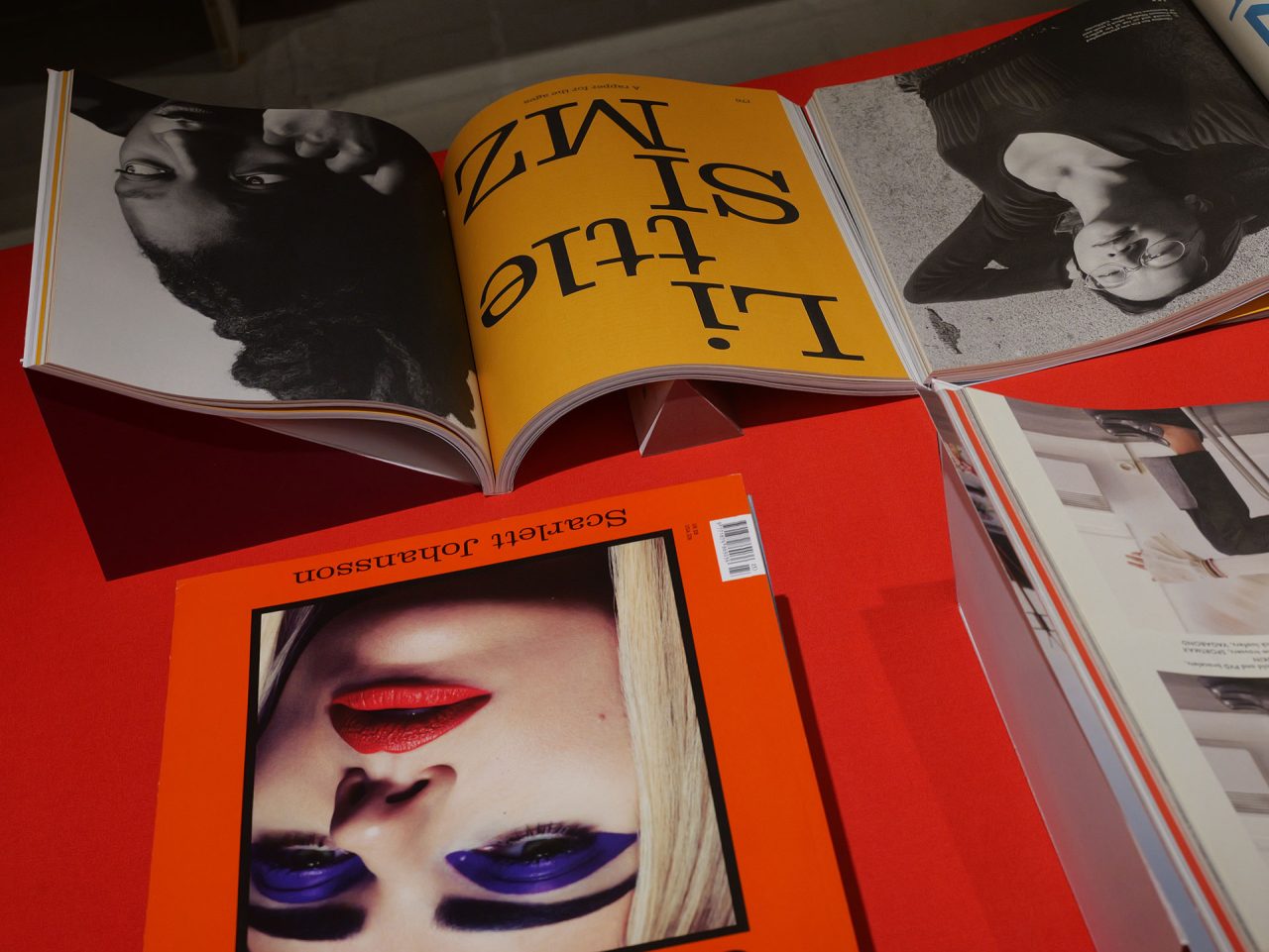
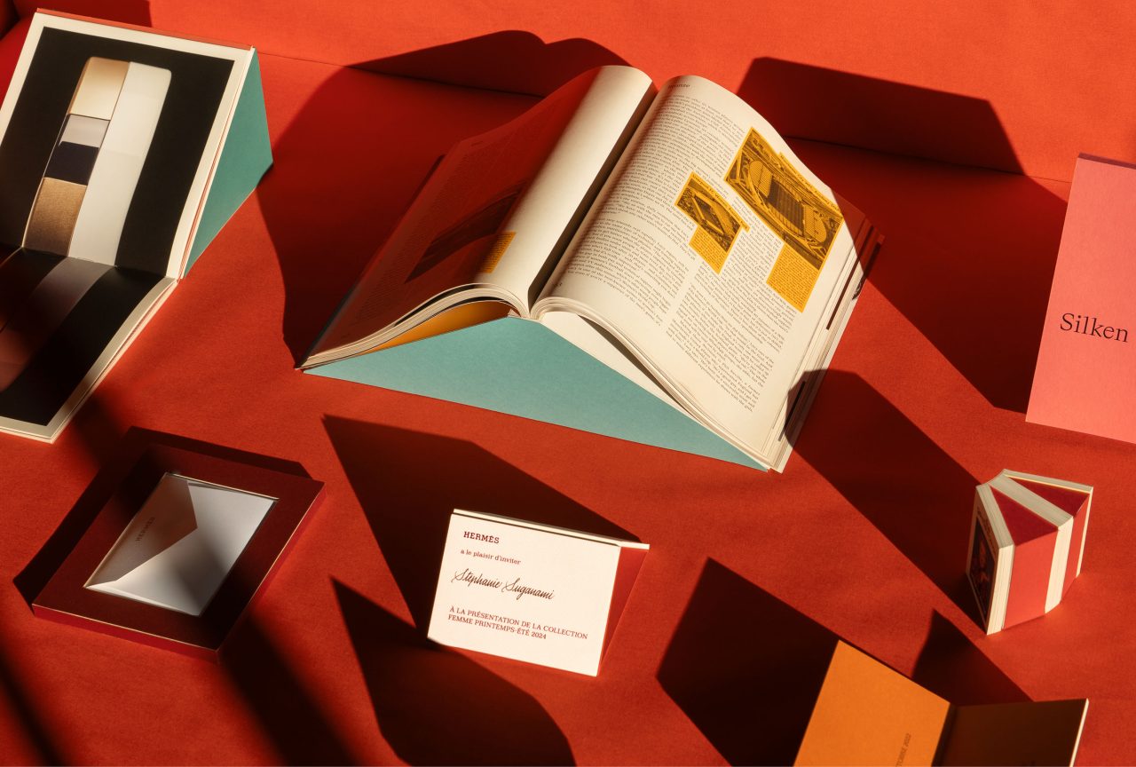
ザ・ジェントルウーマンとデルフィーナ・デルトレーズによるカクテルニードルのパッケージ
Photography by Hanna Moon
©︎Veronica Ditting
—日本の印刷物やクリエイティブについて何か思うことはありますか?
私は長年、日本から来た素材やパッケージに魅了されてきました。仕事上、幸運にも竹尾ペーパーライブラリーを持っており、紙やその他の素材に関する素晴らしいインスピレーションの源となっています。紙の特異性にどれほどの価値が与えられているかを見るのは素晴らしいことです。多くの紙が標準化され、ここ10年ほどの間に多くの製紙工場が倒産したヨーロッパとは対照的です。日本は今回が初めてなので、こういう機会を通じて東京や京都のクリエイターとつながることができるのはとても光栄なことです。来日前に、仲間やデザイナー、写真家などの才能ある人たちと連絡を取りあえているのは幸運ですね。
—ヨーロッパのデザインやクリエイティブ業界の第一線にいらっしゃって、感じる変化などはありますか?
近年、ソーシャルメディアや、携帯電話や頭の中にあるイメージの移動経路のせいで多くのデザインや写真はより標準化され、似たようなものになっているように思います。人々はプロセスを深く探求することなく、ただ左から少し、右から少しをコピーしているように見えます。レファレンスを探すのに費やす時間も非常に短くなっていますね。さらに、悲しいことに最近はコピーされても気にしないブランドまであります。これは非常に残念なことだと感じています。ユニークな視点を持ち、誠実さと仕事に対する倫理観を持って努力することは、私にとってとても大切なことです。

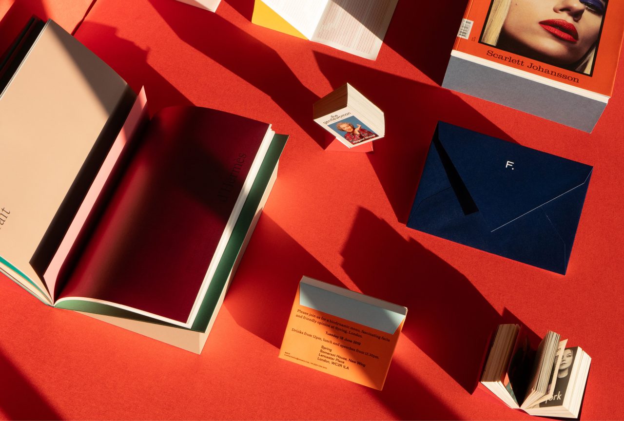
2020 年に Hermès Beauty を立ち上げて以来制作したプレス出版物やイベント招待状 ©︎Veronica Ditting
—そもそもこの世界に足を踏み入れるきっかけは何だったのでしょうか?
亡くなった祖母は、私が幼かった頃、祖母の家を訪ねるたびに家族写真の入った箱を見せて欲しいとねだったという話を教えてくれました。この話から、幼い頃からはっきりと写真に魅了されていたことがわかりますね。私はバイリンガルとして育ち、いつも言語やコミュニケーションデザインに強い関心を持っていました。最近、言葉遊びや翻訳などで埋め尽くされた学校の日記に出会いました。まだ10代の頃、雑誌やキャンペーンにも興味を持ちましたが、私が育った地域では普通の雑誌しか手に入りませんでした。夏休みに私が机に向かって Jil Sander (ジル・サンダー) のフレグランスの広告を描き直している12歳くらいの写真があります。モノクロのポートレイトが使われていた広告を覚えていますか?私が最も惹かれるのは、創造とコラボレーションの可能性です。基本的に、クリエイティブな対話は創造性を掻き立てます。加えて、幸運なことに私はさまざまな分野の協力者との幅広いネットワークを持っています。コラボレーションすることで、常により強力な結果を得ることができます。
—クリエイティブ・ディレクターを目指している人、関心のある人にアドバイスはありますか?
自分の時間をかけてスキルを磨き、本当に自分のものにすることです。さらに、左や右を見て惑わされず自分の道を歩み続けることです。

—I can see your excitement through your Instagram about your first solo exhibition in Kyoto! How did you start the project with curator Emily King, and how did you communicate and prepare for the exhibition?
Emily King and me met about twelve years ago when I was still living in Amsterdam and she was writing regularly for Fantastic Man and The Gentlewoman at the time. Her work as a design historian with a focus on graphic design always stood out to me. Then in 2020 we worked together on the Designs of the Year show at the Designmuseum London. During late autumn last year she was approached by kyoto ddd gallery(ddd) to curate an exhibition and asked me. I didn’t overthink it and pretty much immediately agreed to it. A lot of my design heroes have exhibited at ddd and ginza graphic gallery(ggg) and coming to Japan for a project has been on my wish list for as long as I can remember.
Nowadays Emily and me are both London based, for a while we organised weekly or bi-weekly meetings at my Barbican office to go through my print archive and discuss selections and the overall approach for the show. I’m fairly good with keeping my physical archive updated, but the exhibition definitely put it to the test.
Doing a show on my work could take on so many different directions and forms. A lot of my work is based around image-making, but given ddd’s focus on graphic design we primarily framed the show from this angle. Showing graphic design can be challenging, due to the nature of the pieces. The idea of building stands out of super-sturdy board came rather quickly to me – it is all about making the pieces three-dimensional. We meticulously built a total of 155 stands at my office.
—The exhibition will display your various works from the past 20 years. When you look back on those years, did anything particularly stand out to you? Also, ‘The Gentlewoman’ undoubtedly marked a significant turning point in your career. Are there any works from that period that remain vividly in your memory?
To be honest, looking back at my own work isn’t something I ever do; I always think of moving forward or the next thing. Working on the Folio Folio Folio gave reason to pause and do so with Emily together.We only included works in the show that are meaningful in terms of my development, the collaboration with peers or have the character of a series. I’ve worked on the magazine for a little over twelve years, evidently the turning point developed over a very long period of time.

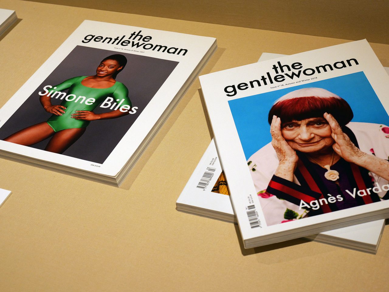
Cover photography by Inez & Vinoodh ©︎Veronica Ditting
We included Andy, which was a publication I worked on for the Stedelijk Museum back in 2008. This was early in my career and a brilliant opportunity at such young age. The team consisted out of myself and editor Arjan Reinders; we only had two weeks from the very start to finish – including imagery and text. Most included images show Andy Warhol in his modeling capacity and appearance in popular media such as advertising campaigns and editorials. We were lucky to be granted image usage by both Oliviero Toscani and Ron Galella; their images basically made the publication.There’s sections in the publication which heavily influenced the reference sections and information-layering in The Gentlewoman.The turnaround was wild and I remember the last two nights I pulled all-nighters to make the printing deadline.

Photography by Qiu Yang ©︎Veronica Ditting
—I heard the exhibition including Qiu Yang’s photography will focus on the unique physicality of the printed materials you have created. We are very excited about this opportunity to experience your passion for printed matter. Besides magazines, you have also created invitations and other printed materials. What do you value most when working on printed materials?
The simple gesture of how a printed object feels in your hands is something I consider in many steps of the process. This connects to the values of tactility and materiality. My work is quite studious and I enjoy the formal exploration of a printed object; any project for me starts with the scale and ratio.From material sourcing, to colour scheme and precision to the print process, all steps within the design process are considered and this is what makes my work specific I believe. The aspect of working closely with printed and bookbinders speaks to the element of craft in printed matter.Qiu Yang and me studied at the Gerrit Rietveld Academy around the same time and I always liked how he photographed my works. There’s twelve posters in the exhibition, each shows a different a different aspect of my approach and process. From mixing my own Pantone colours to explorations in scale and ratios, these images essentially reveal and celebrate printed matter.

Photography by Qiu Yang ©︎Veronica Ditting
—On the other hand, we cannot ignore the importance of digital expression and design in this era. From your Instagram, we feel that you positively embrace digital media. How do you engage with digital and social media?
Digital is such a big part of projects we work on these days. Say if we work on a campaign for a fashion house, the moving image only lives on the brand’s website and social media. For my own social media, I don’t aim for perfection. I couldn’t even achieve perfection if I wanted to – it seems like I’m always about a season late with posting anything and looking through my feed there’s many project gaps.
—Can you tell us about the differences between printed design and web design? Are there any definitive differences?
With print the outcome is a definitive; one size, one ratio. At some point you hand over the files to the printer and there’s only one version. There’s also no way back after something has been printed and bound.With web design there no clear end in sight and it’s much more malleable in terms of form too, therefore it doesn’t have as much of a clear definition. You need a different mindset for either.
—You have worked with many wonderful creators over the years. Are there any projects that particularly stand out to you? How did those projects influence your approach to creativity?
Looking back at my work from over the course of nearly 20 years there are a few projects that stand out to me because of the experience, collaboration and also the learning curve on these. For example the monograph ‘The Complete Incomplete Series’ by Barbara Visser back in 2008 is a project that really taught me a lot about image editing. I used to be Barbara’s assistant for a year after graduating from the art academy, therefore I knew her archive extremely well. This gave me the opportunity to include a lot of works that were maybe not part of her best known pieces yet.We pulled in references, B-roll imagery and reproductions in publications in order to illustrate her photographic projects in a more complete manner. Over the course of the project I reworked the image edit and also sequence a multitude of times. The rhythm you can achieve with image sequencing means the viewer is taken on a distinctive journey.
Another project that comes to mind is the exhibition design for ‘English As A Second Language’ by Hanna Moon and Joyce Ng at Somerset House, curated by Shonagh Marshall back in 2019. Hanna and Joyce approached me to work on the exhibition design. This was the first time I worked on a spatial design and given my background in industrial design, it was the first opportunity for me to show this skill set.The room dedicated to Hanna’s work was painted midnight blue with prints mounted on boxes that appeared to be part of the gallery walls. Meanwhile Joyce’s room was partitioned with a zig-zag construction that held some of her work. Each image was explained by two captions, one giving technical information and the other context, both presented on custom-made powder-coated caption panels.‘English As A Second Language’ was one of the most visited exhibitions Somerset House had in that space at the time. It’s a project I’m still proud of.
©︎Veronica Ditting
©︎Veronica Ditting
©︎Veronica Ditting
—Do you have any thoughts on Japanese printed materials and creativity? Positive or negative aspects are both welcome.
For many years I’ve had a fascination for materials and packaging coming from Japan. In a professional capacity, I’m lucky enough to have the Takeo paper library which is an incredible source of inspiration for paper and other materials. It’s a beauty to see how much value is given to specificity of paper.
This stands in stark contrast to Europe, where many papers have become more standardised and a multitude of paper mills have gone bankrupt over the last ten years or so. It’s my first time in Japan so I’m beyond thrilled to connect with creators in Tokyo and Kyoto, I’m lucky enough to have been put in touch by peers with designer, photographers and other talents.
—You have been at the forefront of the European design and creative industry, have you noticed any changes or trends nowadays?
I assume due to social media and the way in which imagery circulates in all of our phones and minds nowadays, a lot of design and photography seems to have become more standardised and similar. People don’t seem to be exploring processes in depth and simply copy a little from left and a little from right. The reference time-span has become very short. Sadly these days some brands don’t even mind if something is copied. This is something I find extremely disheartening. Striving for a unique point of view and having integrity and work ethic is something very dear to me.
—What initially led you to enter this field? What attracts you most?
My late grandmother told me that as a toddler, I insisted on her having a box of family photographs for me to review and look at every time I’d come to visit. So clearly I had an obsession with photography from a young age. I grew up bilingual and always had a keen interest in language and therefore communication design. Recently I came across school diaries which are filled with word plays, translations and such.As a young teenager I got interested in magazines and the campaigns, but we could only get the standard ones where I grew up. There’s a photograph of myself, I must have been around 12 years old, sitting at a desk during summer holidays re-drawing a Jil Sander fragrance advertisement. Remember the ones where a black-and-white portrait of hers was used? What attracts me the most is the possibility of creation and collaboration. Essentially, creative dialogue sparks creativity and I’m fortunate enough to have a wide reaching network of collaborators from different fields. In collaboration you can always reach a stronger outcome.
Do you have any advice for those aspiring to become creative directors or those interested in this field?
Take your time to develop your skill set and truly make it yours. Furthermore, don’t look left or right and stay on your own path.
